Hetty Douglas on Emotion, Abstraction, and Raw Material

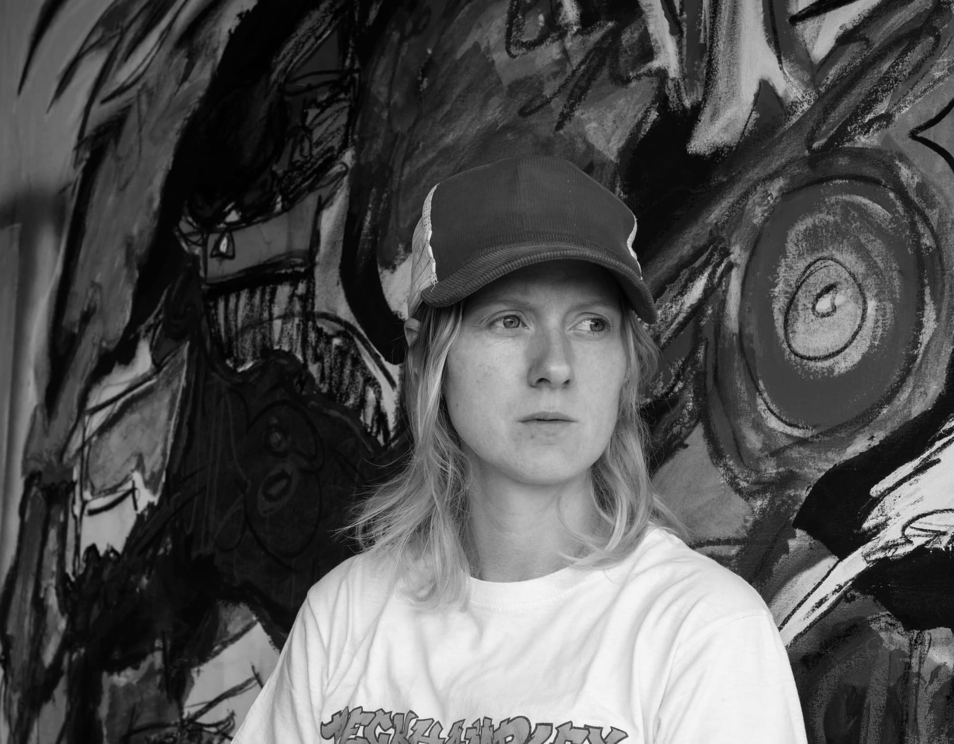
Hetty Douglas in Conversation with DiFranco for Munchies Art Club
There’s no filter soft enough to mute Hetty Douglas.
Her paintings register like emotional weather — fragments of color, concrete textures, and text that lingers like something half-said.
In this conversation with DiFranco (Pikazer0), Douglas doesn’t explain her work — she traces its edge.
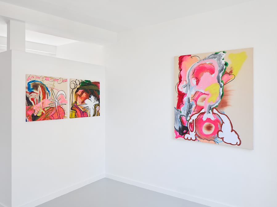
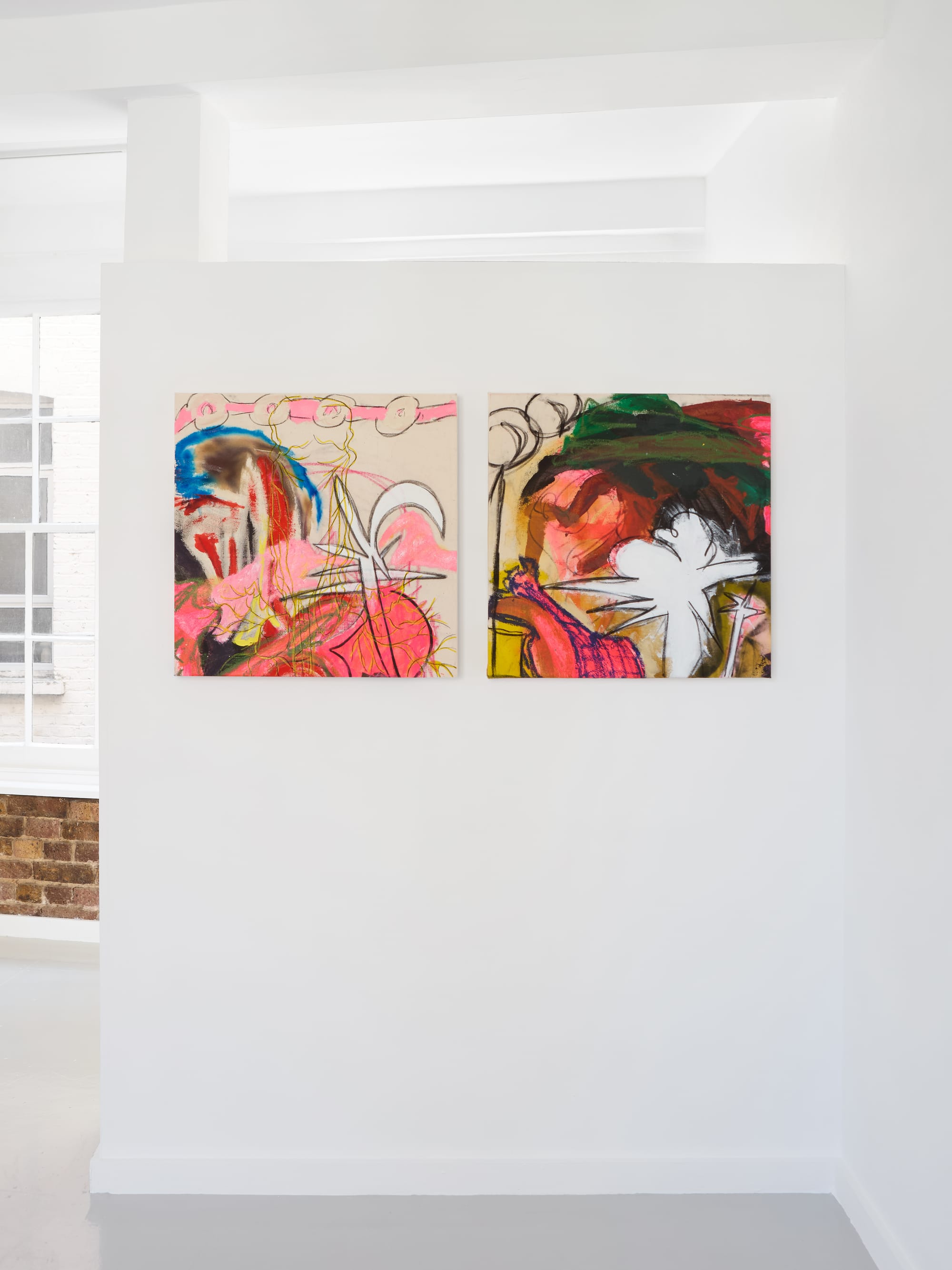
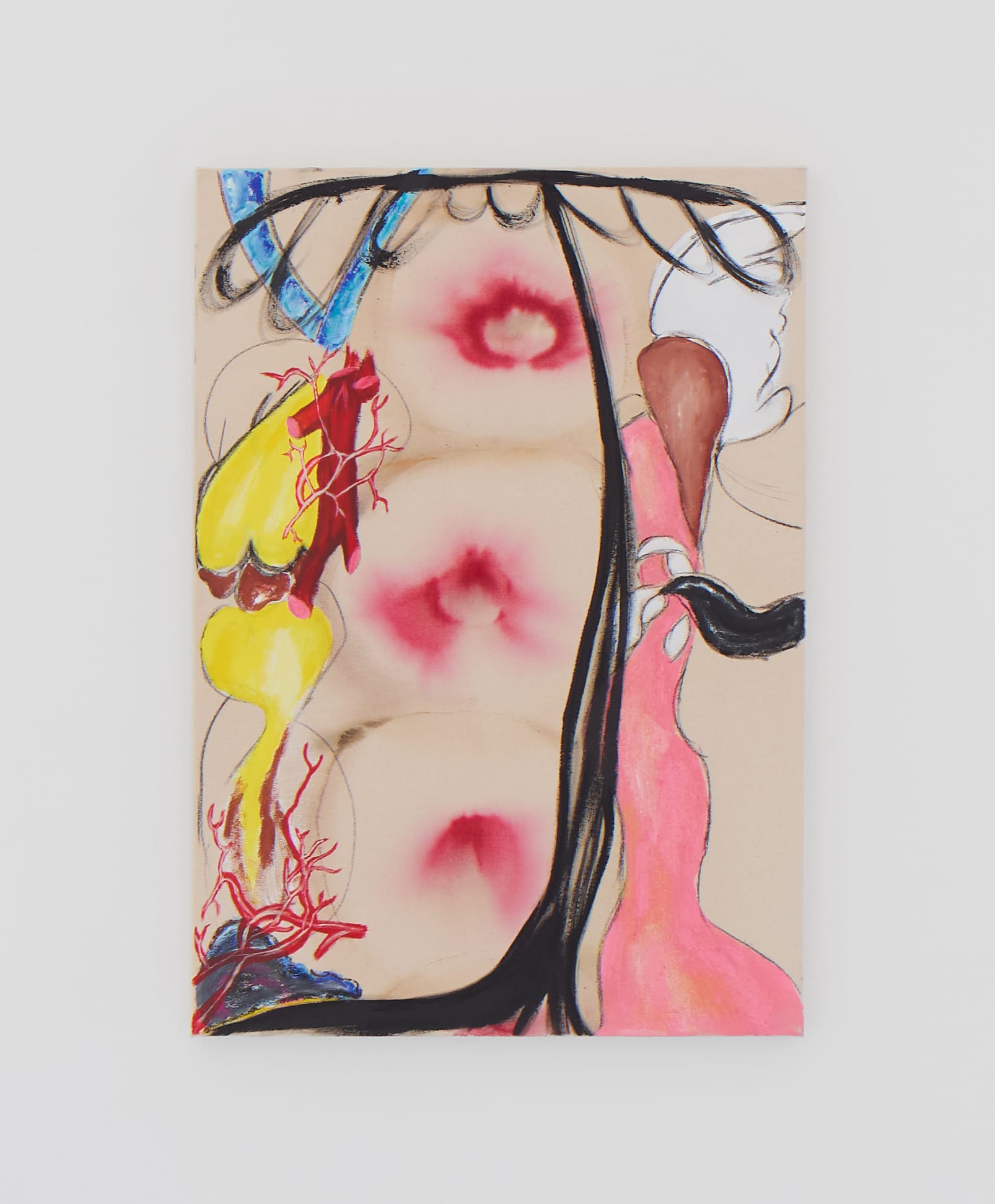
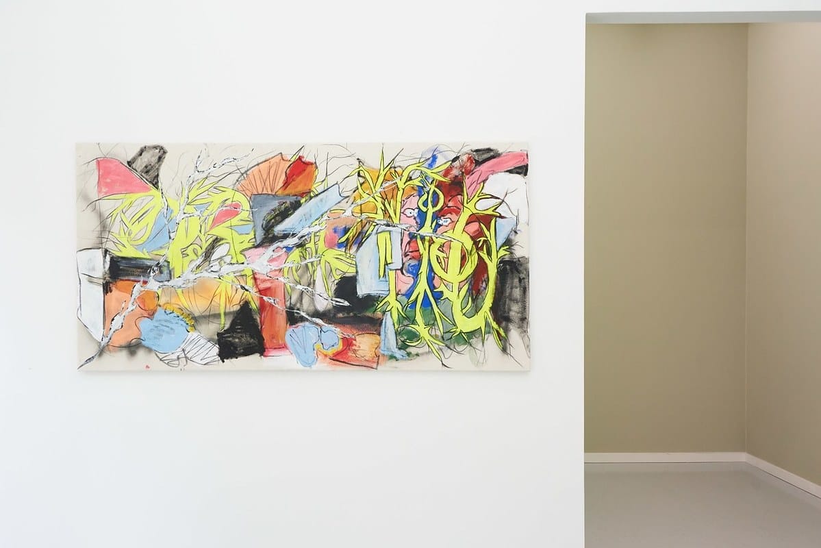
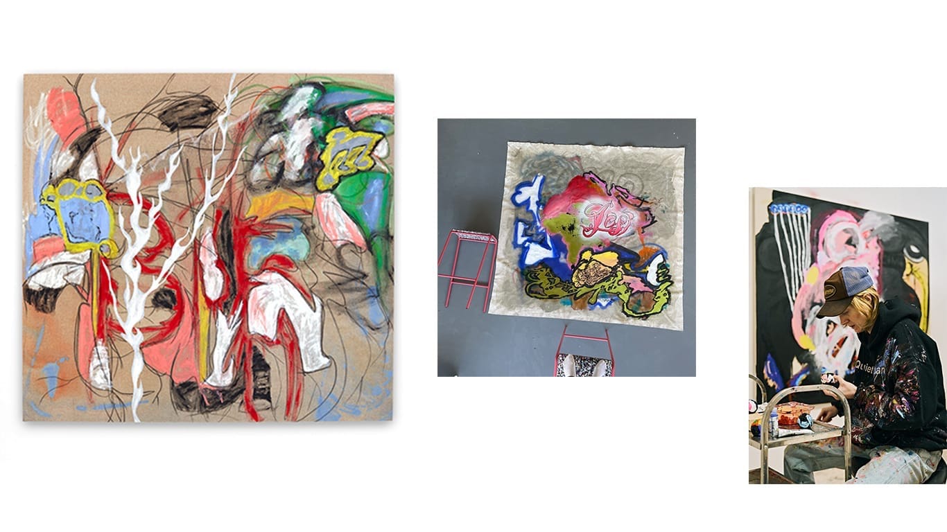
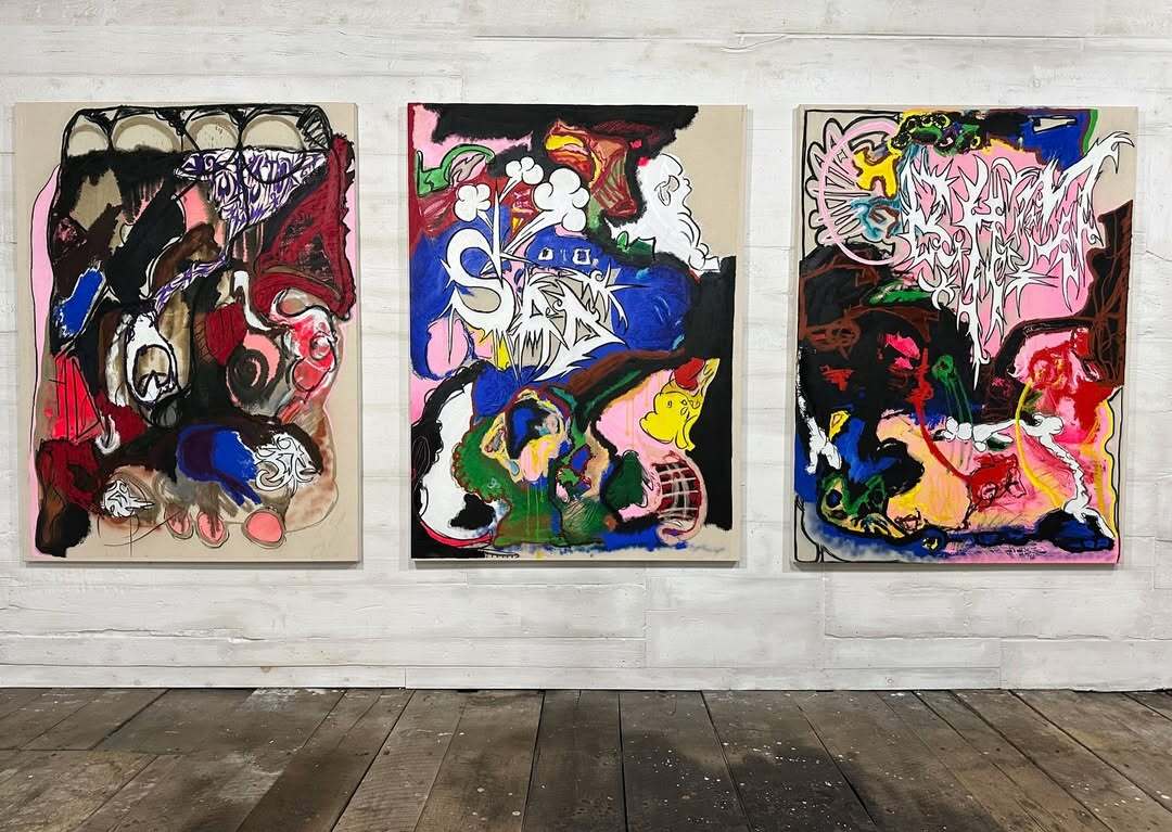
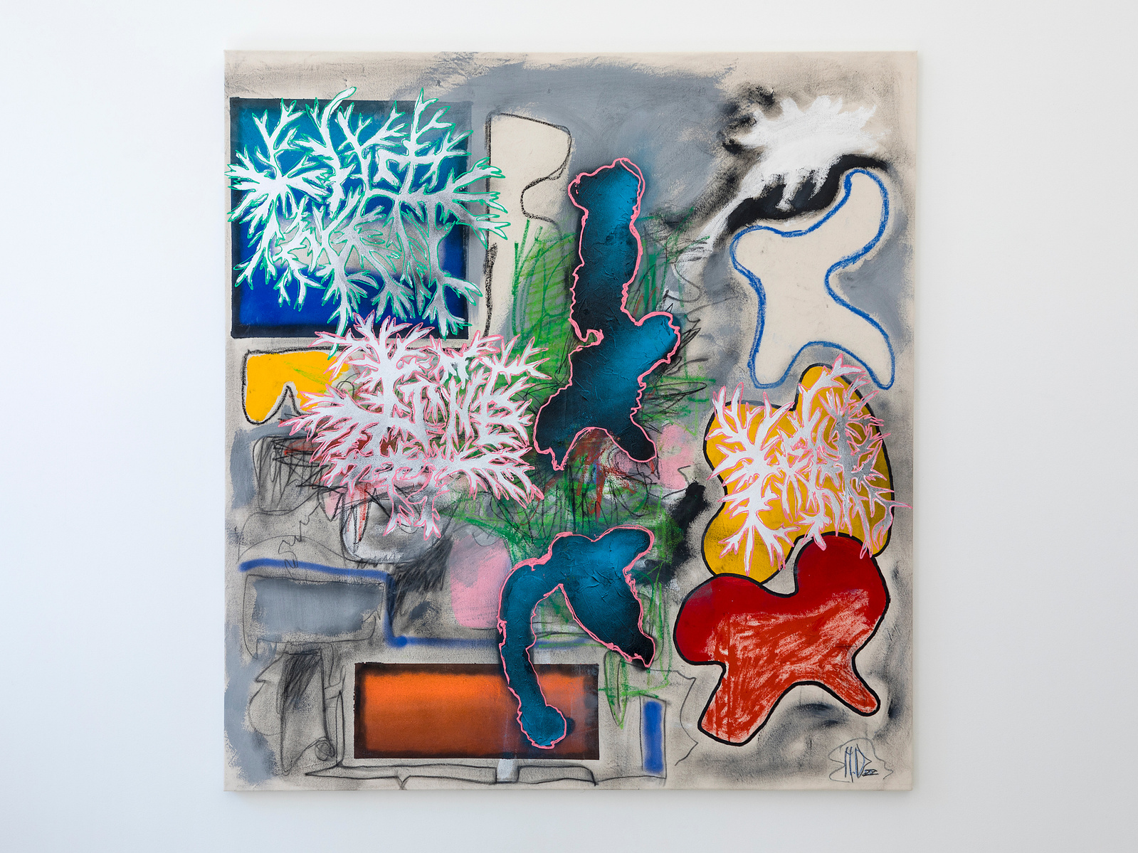
Left to right → Wondering Nerve, 2025, and Angel in Chaos, 2025. Both works are acrylic, ink, oil bar, and charcoal on canvas, 61 × 61 cm. Photo by Ollie Hammock. Permission and courtesy of the artist, Hetty Douglas
Originally from Sheffield and raised in Nottingham, Douglas moved to London at 18 and built her practice beyond the frame of formal art education.
Her paintings don’t arrive as statements, they arrive as residues.
Cement, plaster, ink, gel: these aren’t embellishments, they’re materials with memory. Each surface feels like it’s holding something back, or letting just enough through
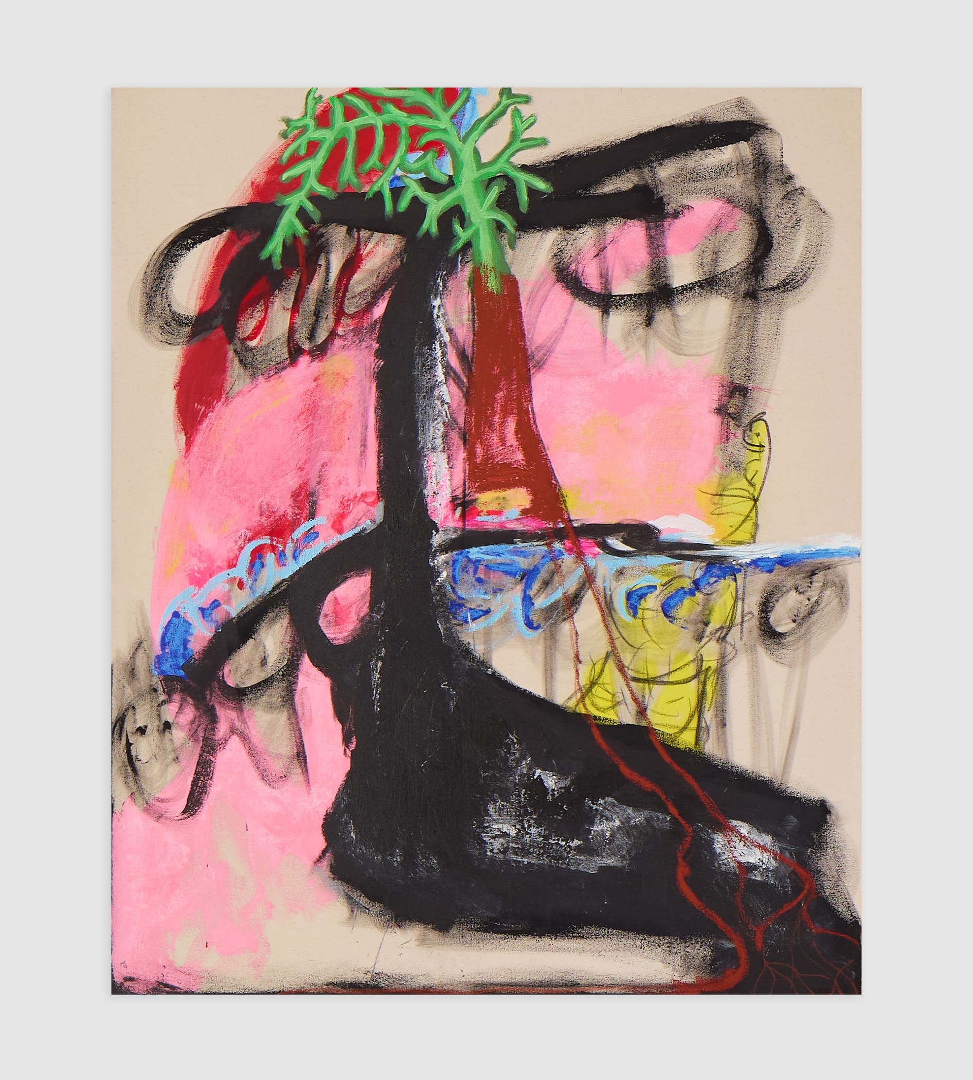
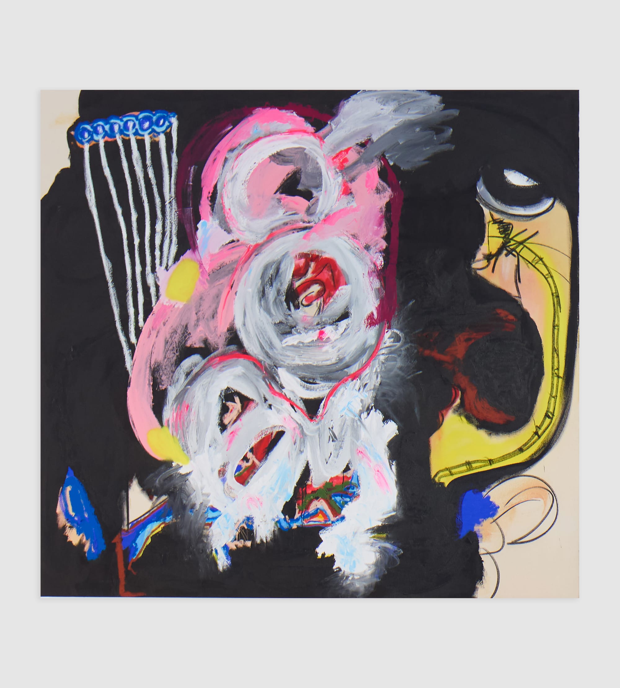
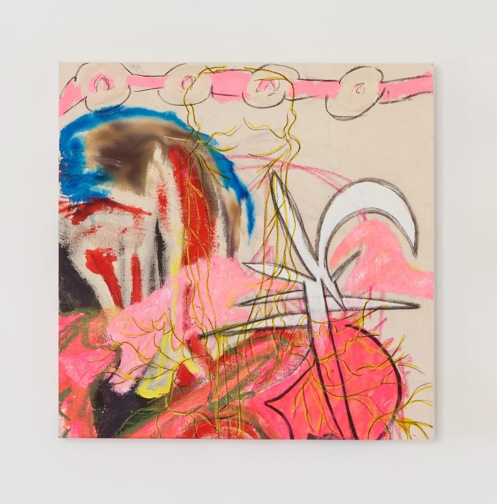
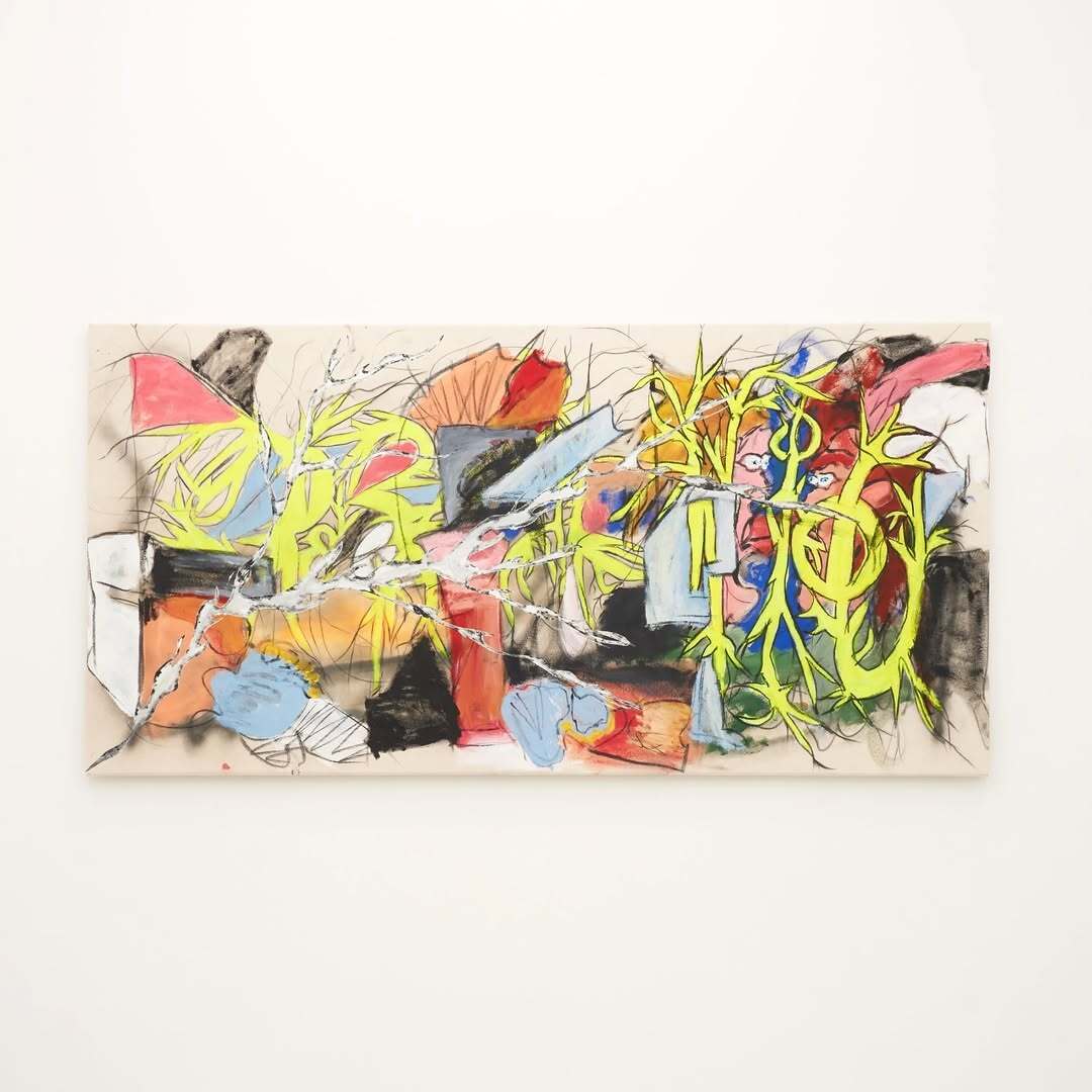
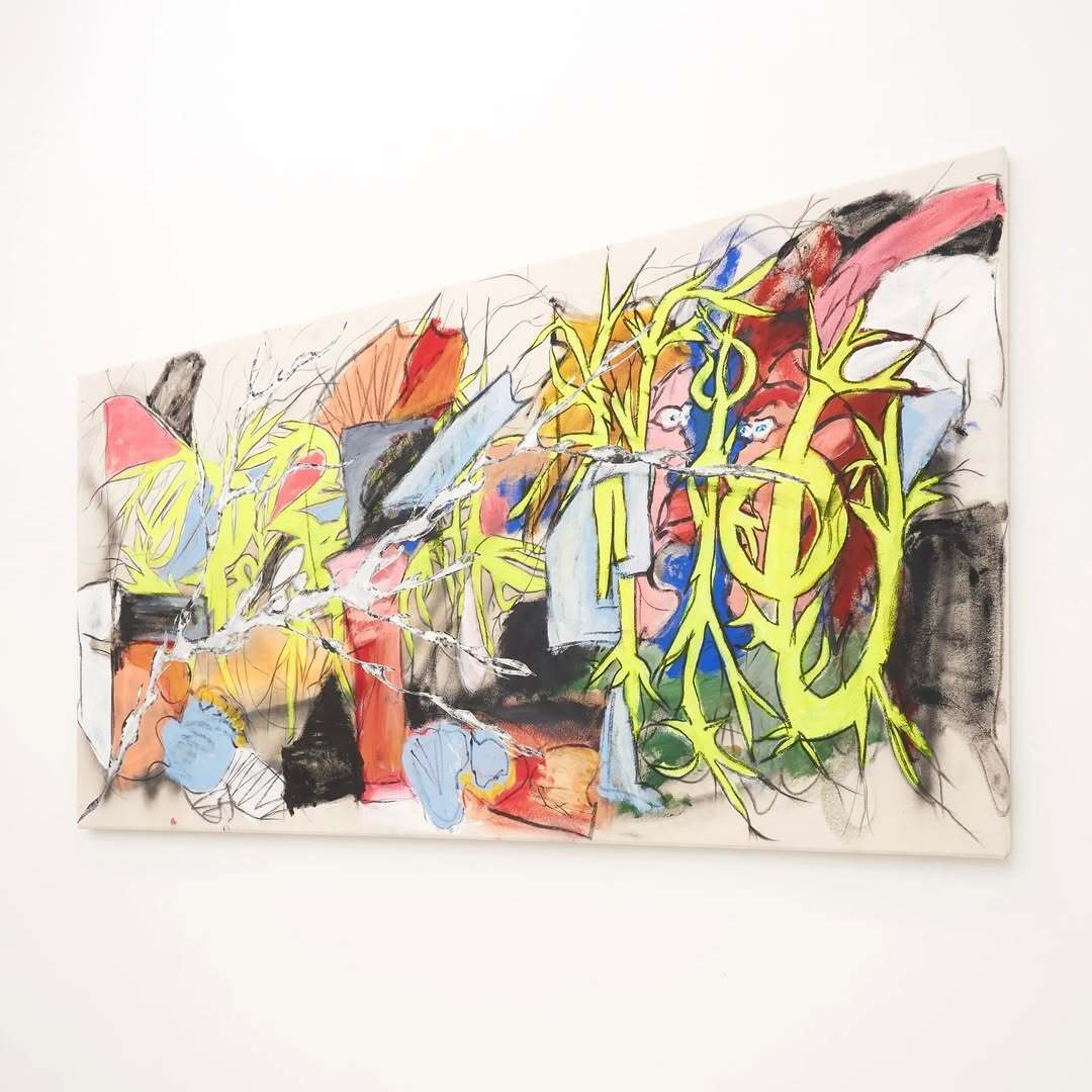
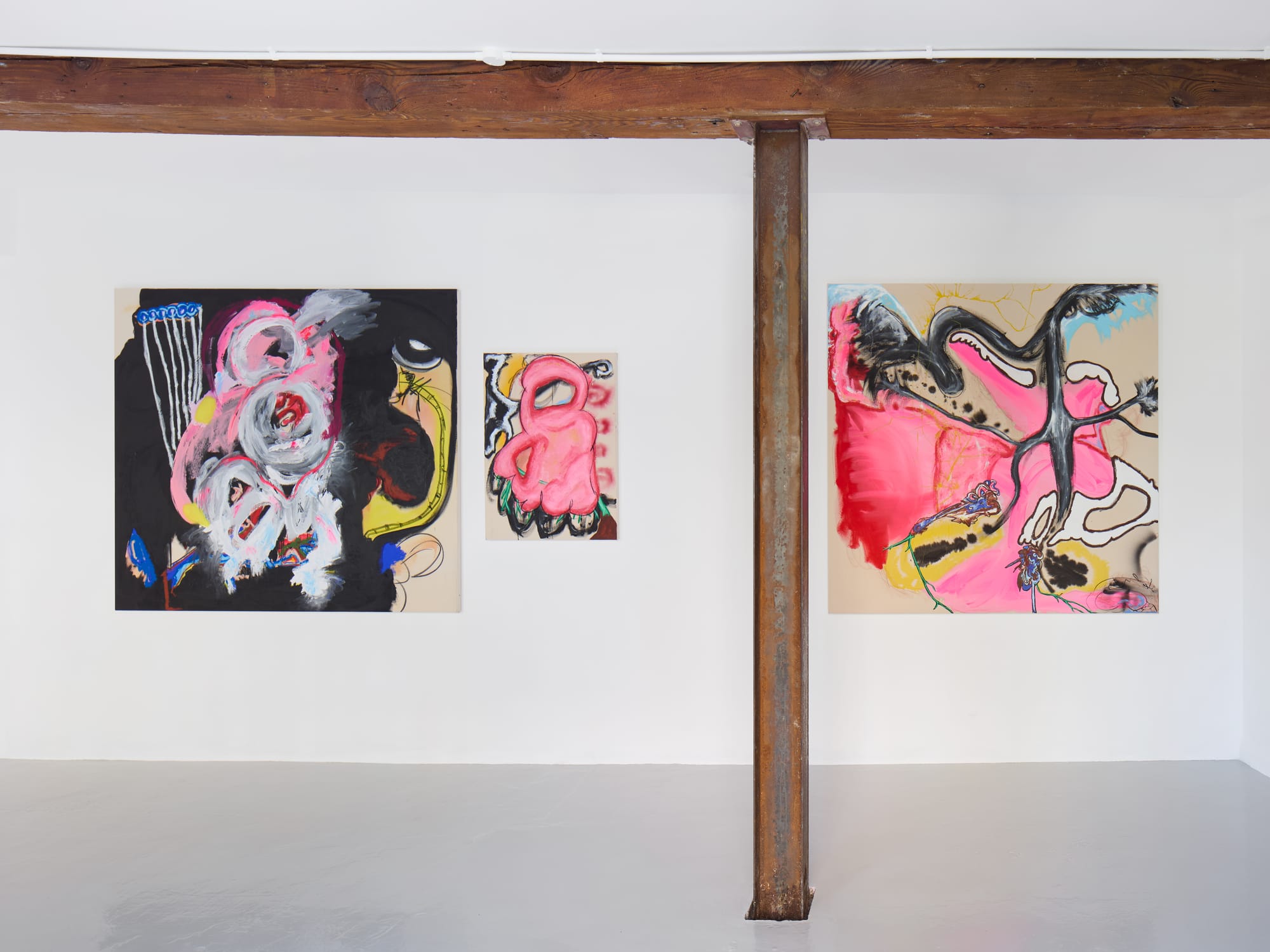
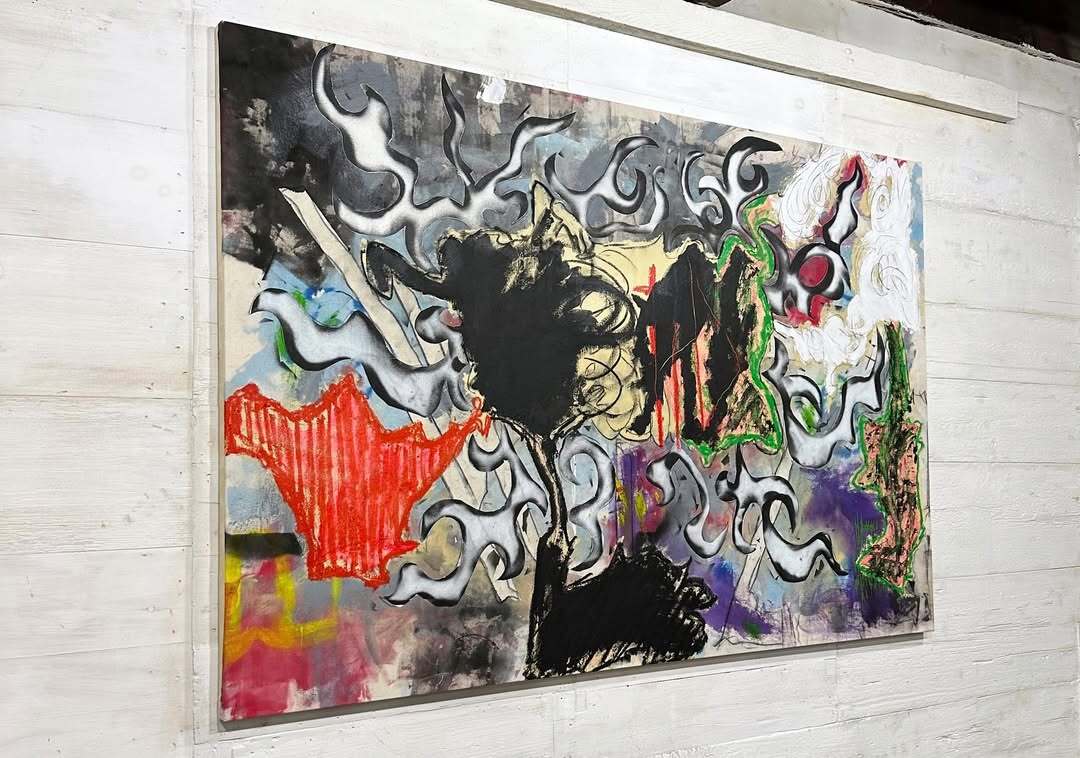
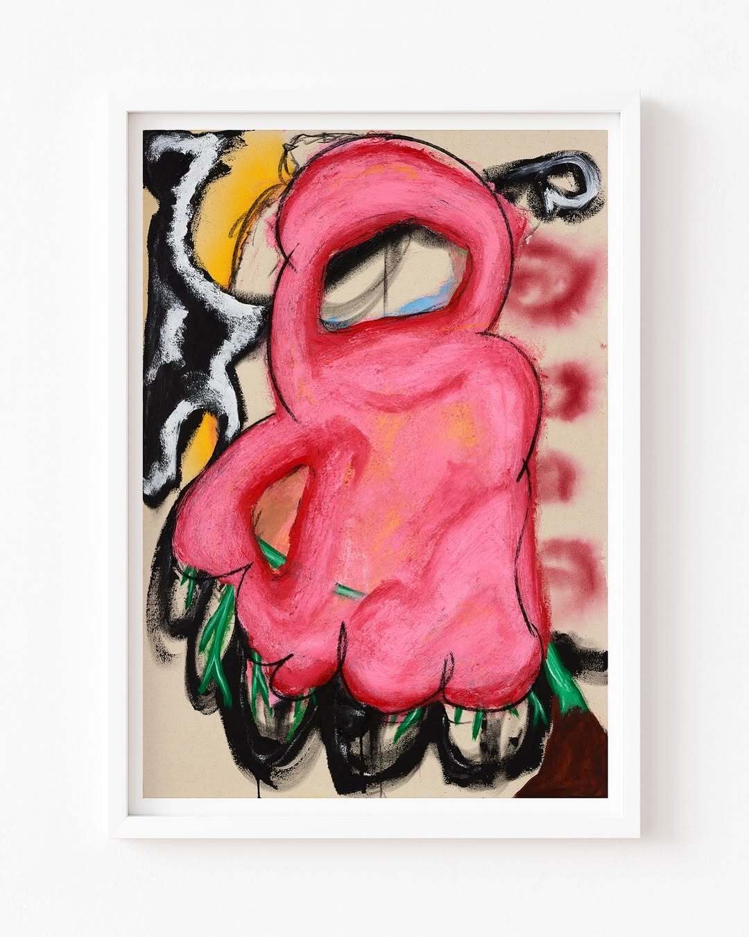
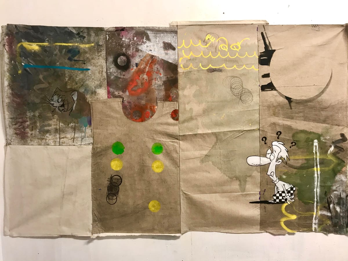
Hetty Douglas, 2025: Ghost Tree (120 × 110 cm), Solar Plexus (87 × 61 cm), Self/Abandonment (150 × 160 cm), and Wondering Nerve, 2025 61 x 61 cm All rights reserved by the artist.
Language sometimes enters the canvas in short, carved phrases: “YOU WERE NEVER,” “STILL,” “STOP IT.” But even without words, her paintings speak.
A shift in color. A texture pulled taut. An atmosphere suspended.
If there’s urgency here, it’s not loud, it’s layered, quiet, and deeply felt.
Douglas’s work resists neat packaging. It’s not performance, it’s presence.
Her forms carry the complexity of emotion without the need for narrative.
She paints not to explain, but to stay close to something — fleeting, internal, maybe unnameable.
This exchange with DiFranco doesn’t decode the work.
It stays with it. Together they trace a visual language where feeling lives in texture, and clarity isn’t the goal, but connection might be.
Welcome to the raw clarity of Hetty Douglas.
You’ll feel it before you find words for it.
Interview Hetty Douglas with DiFranco:
What do you want to say about masculinity, social class, and identity in your paintings?
That’s for the viewer decide for themselves, hopefully the work invites each person to bring their own experiences and perspectives to it.
How do you manage to convey melancholy and sarcasm at the same time in a painting? Like, sad and ironic all at once.
Unintentionally. We all hold a range of feelings, more than one can be true at the same time.
That hopefully comes through.

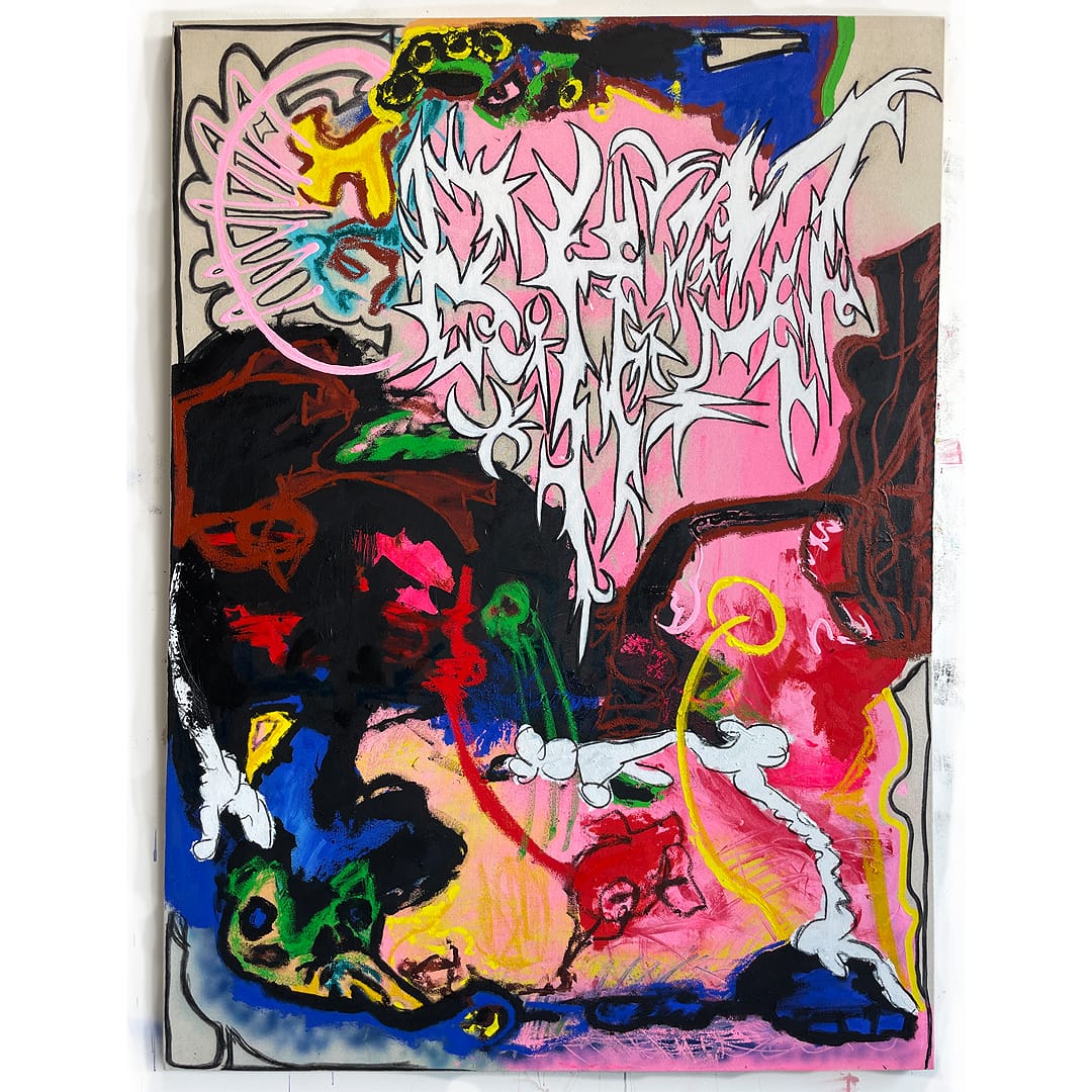
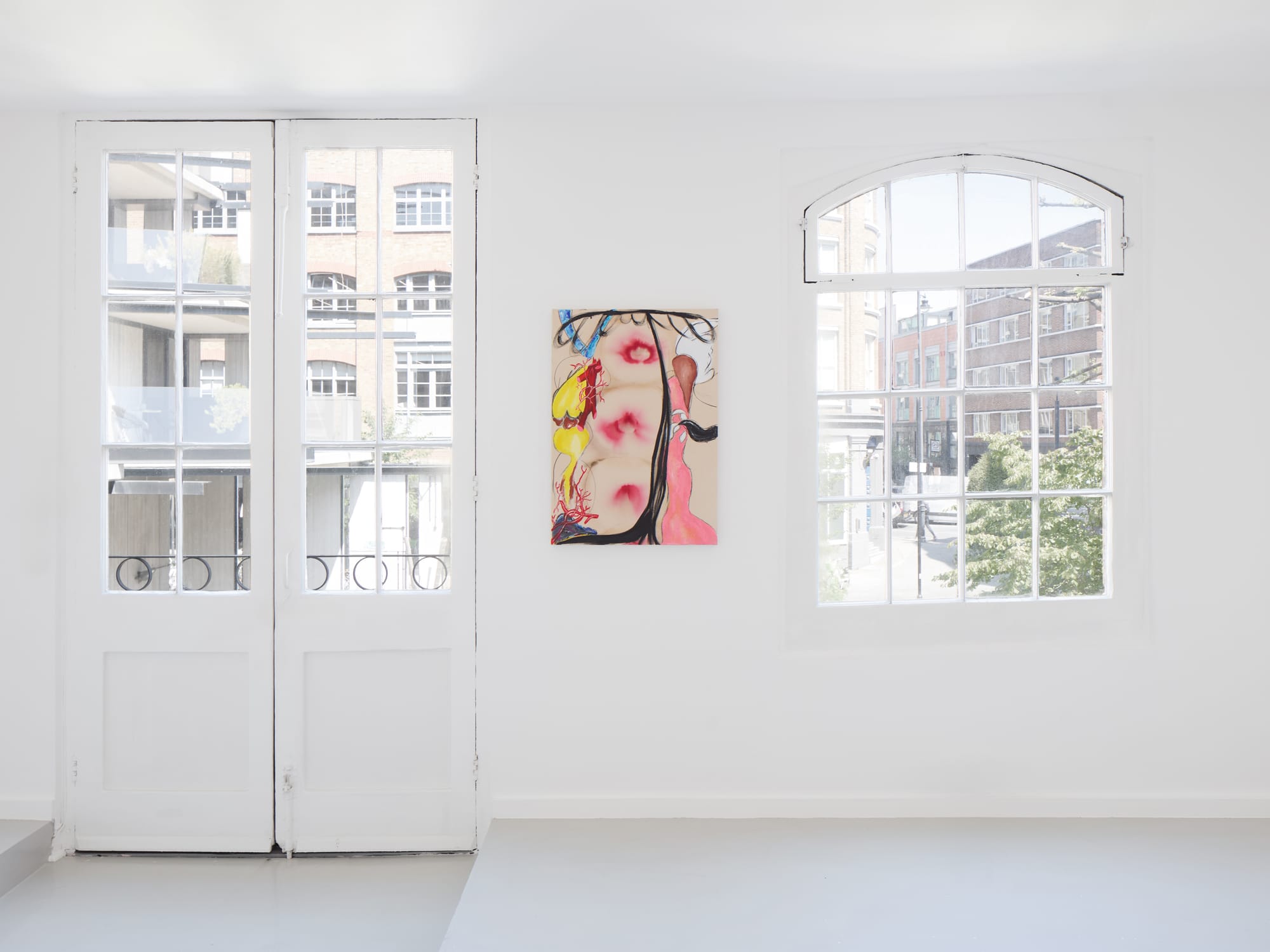
Exhibition Haricot Gallery - Hetty Douglas
Why do you avoid that neat, clean, typical museum-style painting so much?
My work has both neat and messy elements.
When I leave areas of raw canvas exposed, I like that patch to be just canvas.
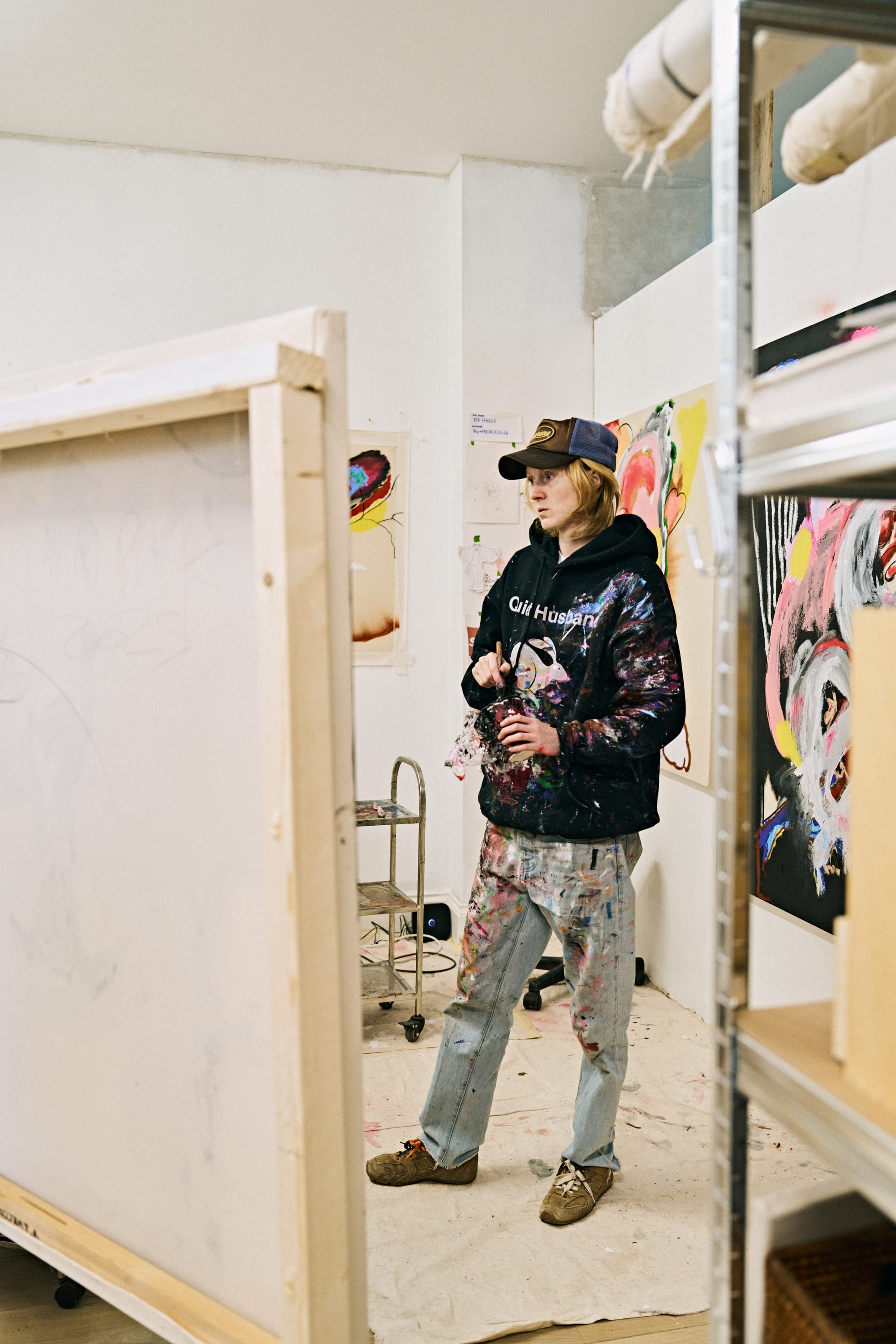
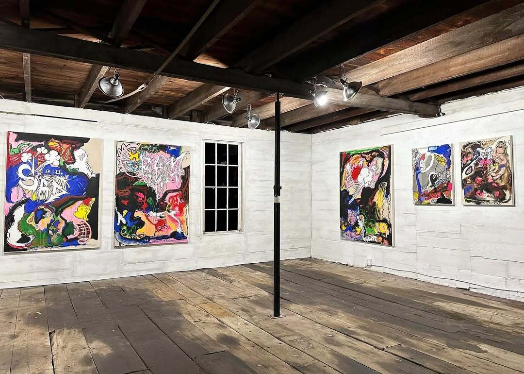
Left: Studio view, photo by Kate Shchegoleva. Right: Installation view, photo by Ollie Hammock. Permission and courtesy of the artist, Hetty Douglas.
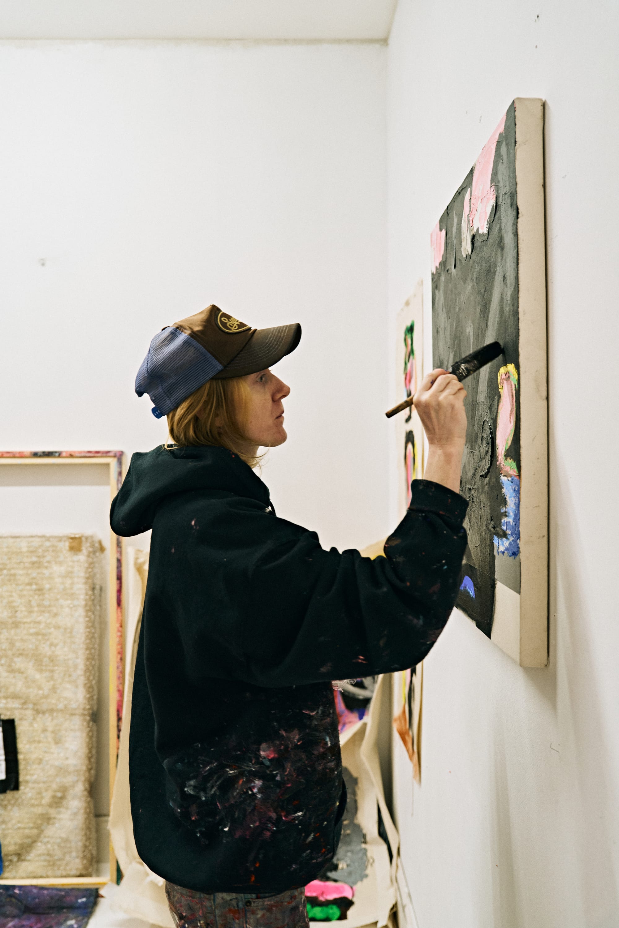
Hetty Douglas in the studio, photo by Kate Shchegoleva → Exhibition view, Miracle State, solo show at Haricot Gallery — installation view, photo by Ollie Hammock. Permission and courtesy of the artist.
It feels like clean air, taking a deep breath. As for “museum style” depends which museum you’re looking at, and how.
And the female body? Even when it’s not visible, do you feel it’s present as a political tension?
The body runs through my practice, not necessarily the female body, just the body..
My last show Miracle State explored where shame lives in the body, how it affects the nervous system and how it gets stored within us.
That can be shaped by nature, nurture, politics,
society… all of it.
That stored shame and tension, it may live inside us.
What role does text really play in your work? Is it urban poetry, social critique, or just visual noise meant to make the viewer uncomfortable?
I don’t use much text anymore, but when I do, it’s like code, distorted and unreadable to the viewer.
Have you noticed that the fonts you use resemble graffiti, gym billboards, or supplement packaging? Is that a coincidence or part of your visual critique?
Supplement packaging! Love that, haha. Had not picked up on it.
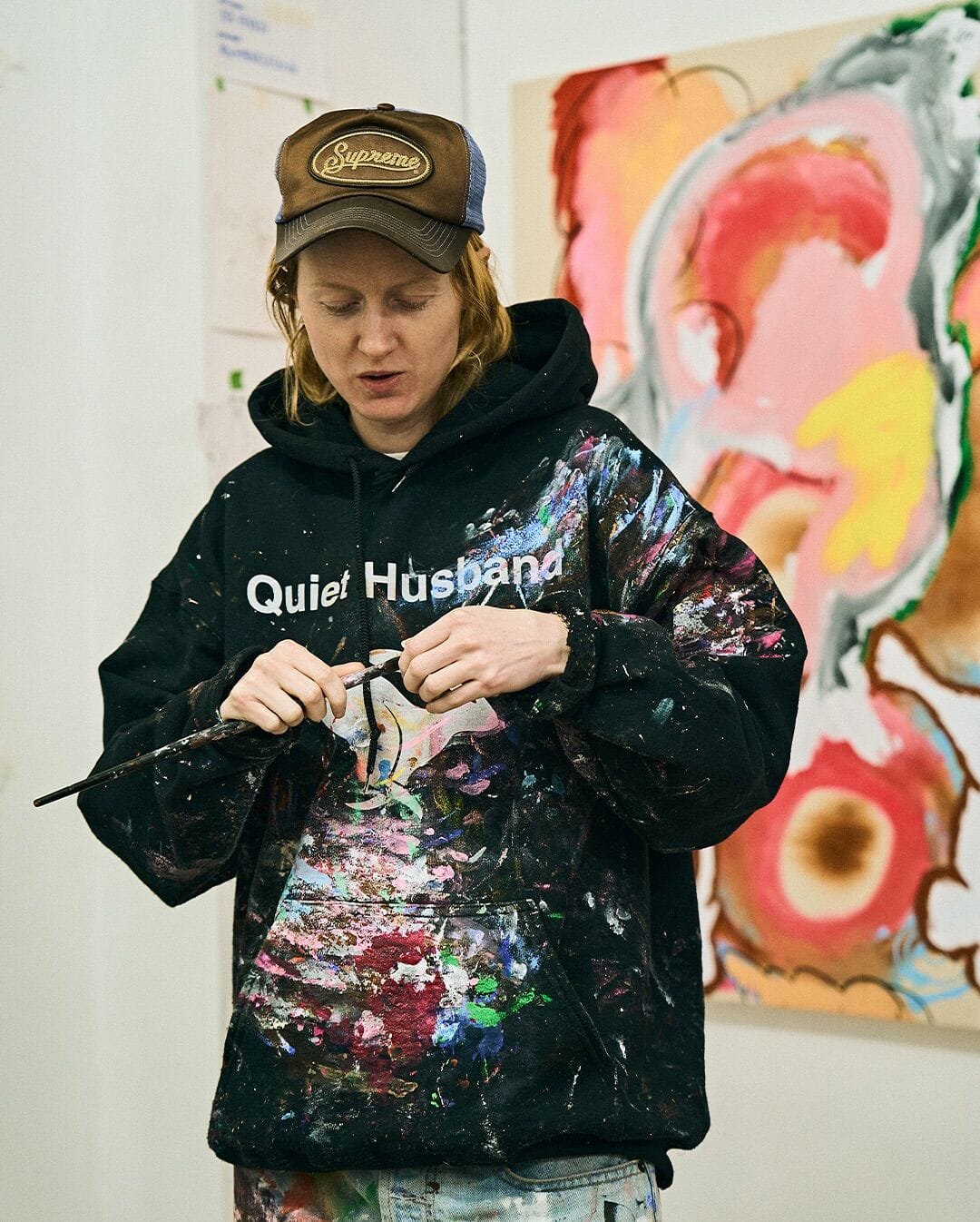
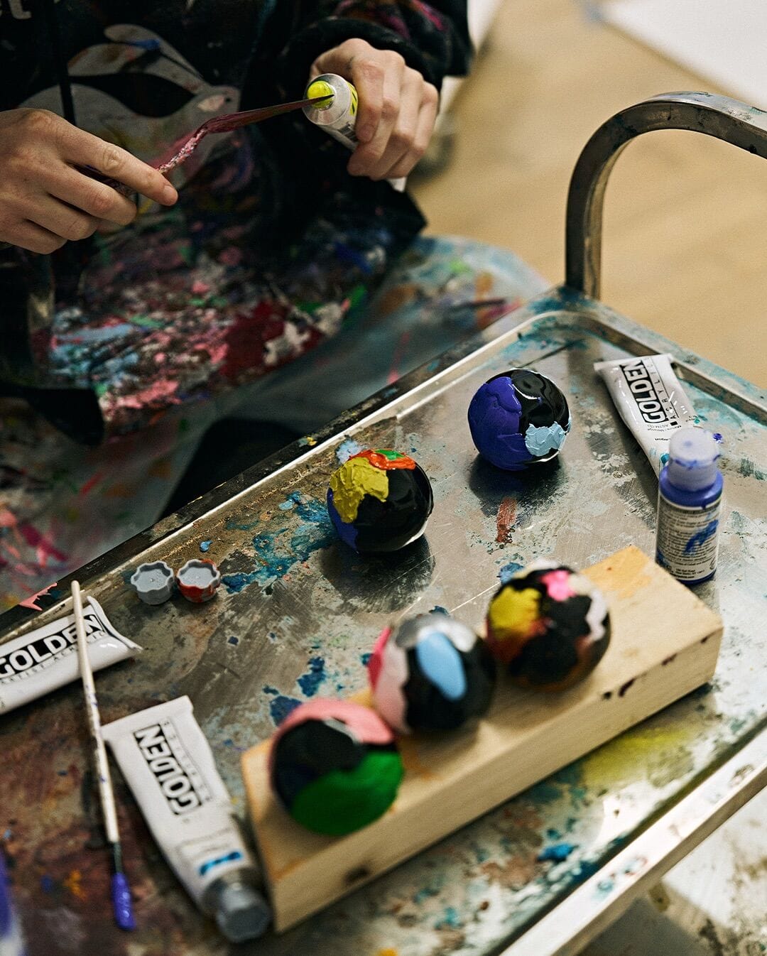
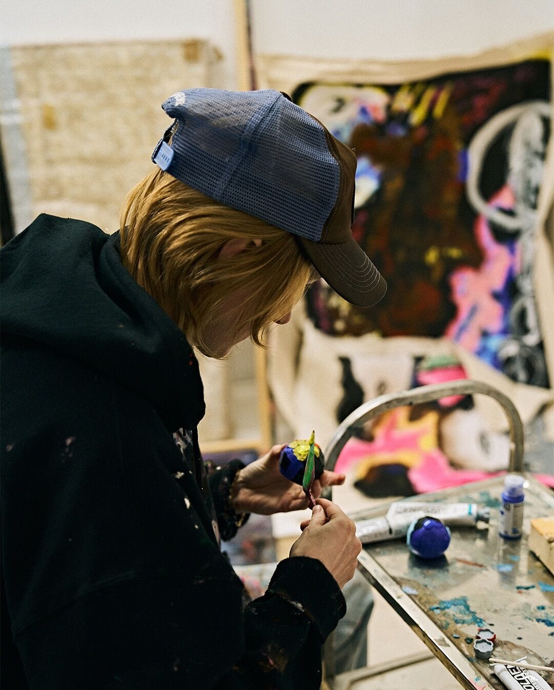
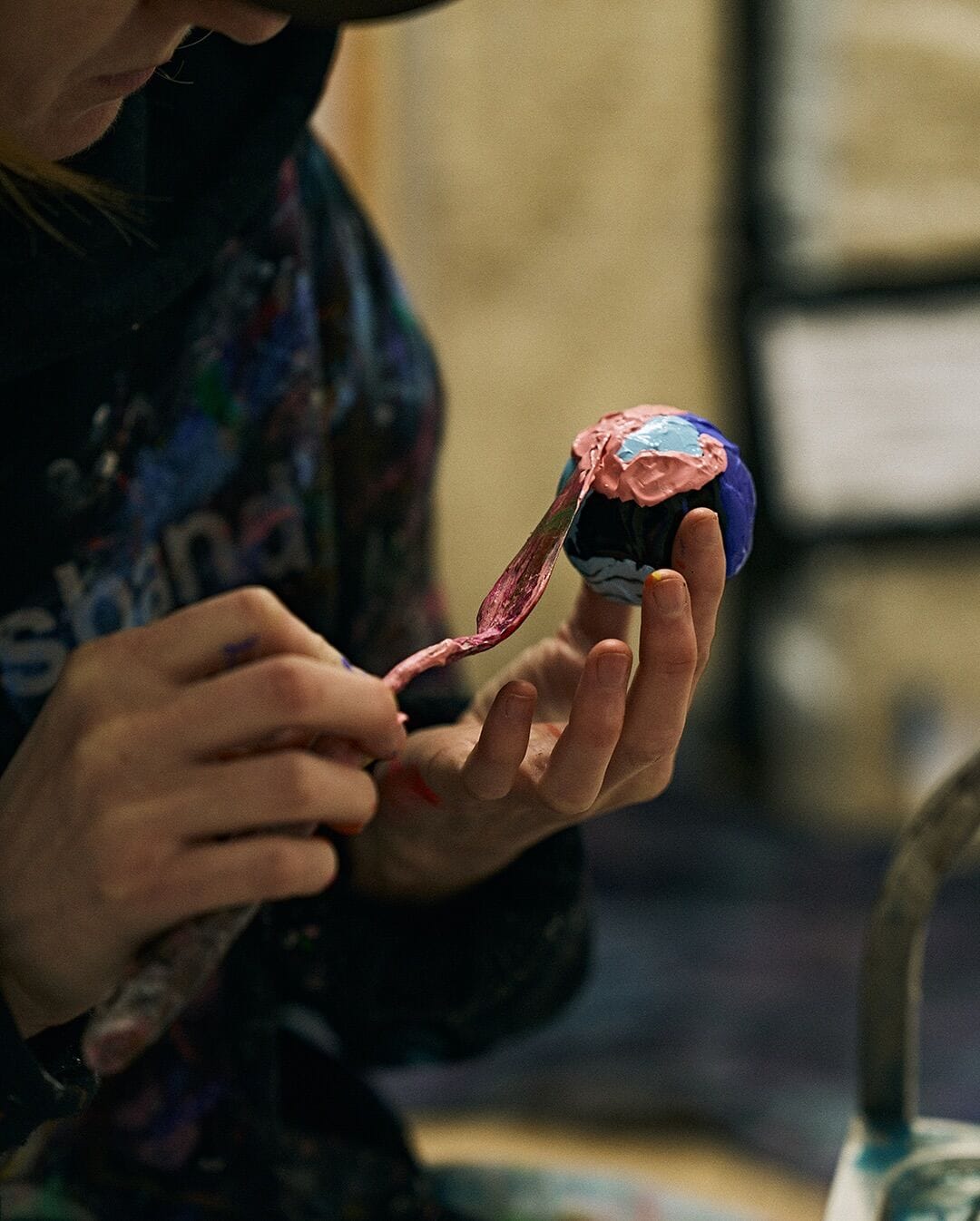
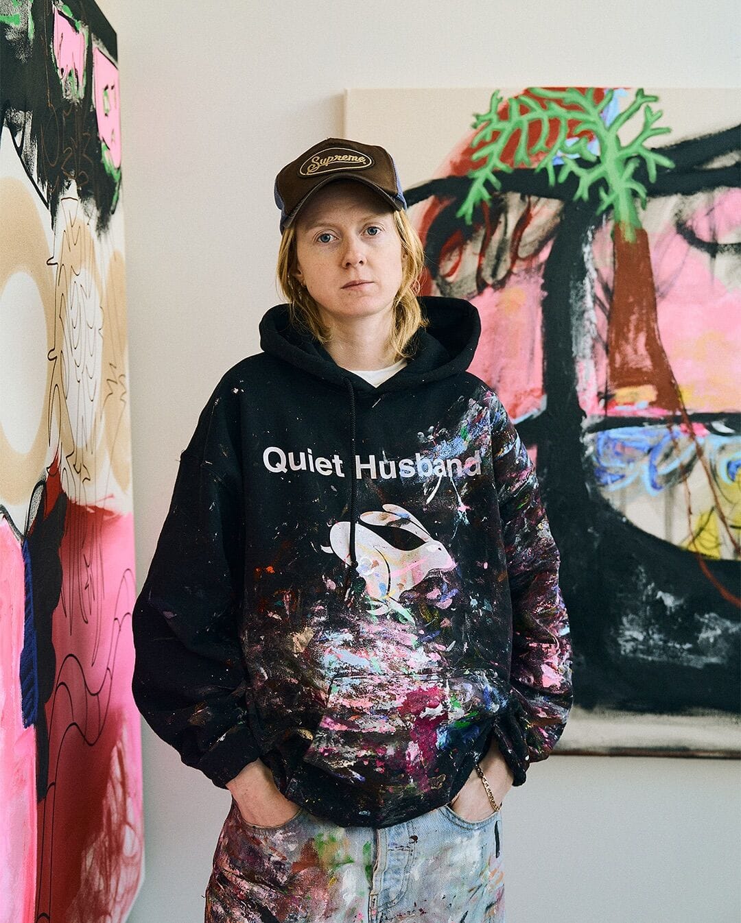
Hetty Douglas: Artist portrait for AFOWER houseofafower — studio view and making-of. Permission and courtesy of the artist.
More recently when using text, the font styles in my work lean toward heavy metal or emo band logos - a testament to my eventful teenage years.
Do you think the use of short, direct, almost meme-like phrases reflects how we communicate today, in the digital age?
I’m pretty direct. But I also love a long essay, caption, text, email etc especially if my girlfriend’s written it.
The colors you use—kind of washed-out and slightly acidic—what kind of feeling do they convey to viewers? Calm or tension?
That journey from tension to calm... that’s a goal... both in painting and outside of it.
Is your work evolved graffiti? Or more like a conceptual remix of what we see on the streets?
In my early work, yeah, graffiti was in there. I grew up in Nottingham, had family in that scene, so it came in subconsciously.
I also love billboards where layers of posters get slapped up and ripped off - they create such good texture without trying.
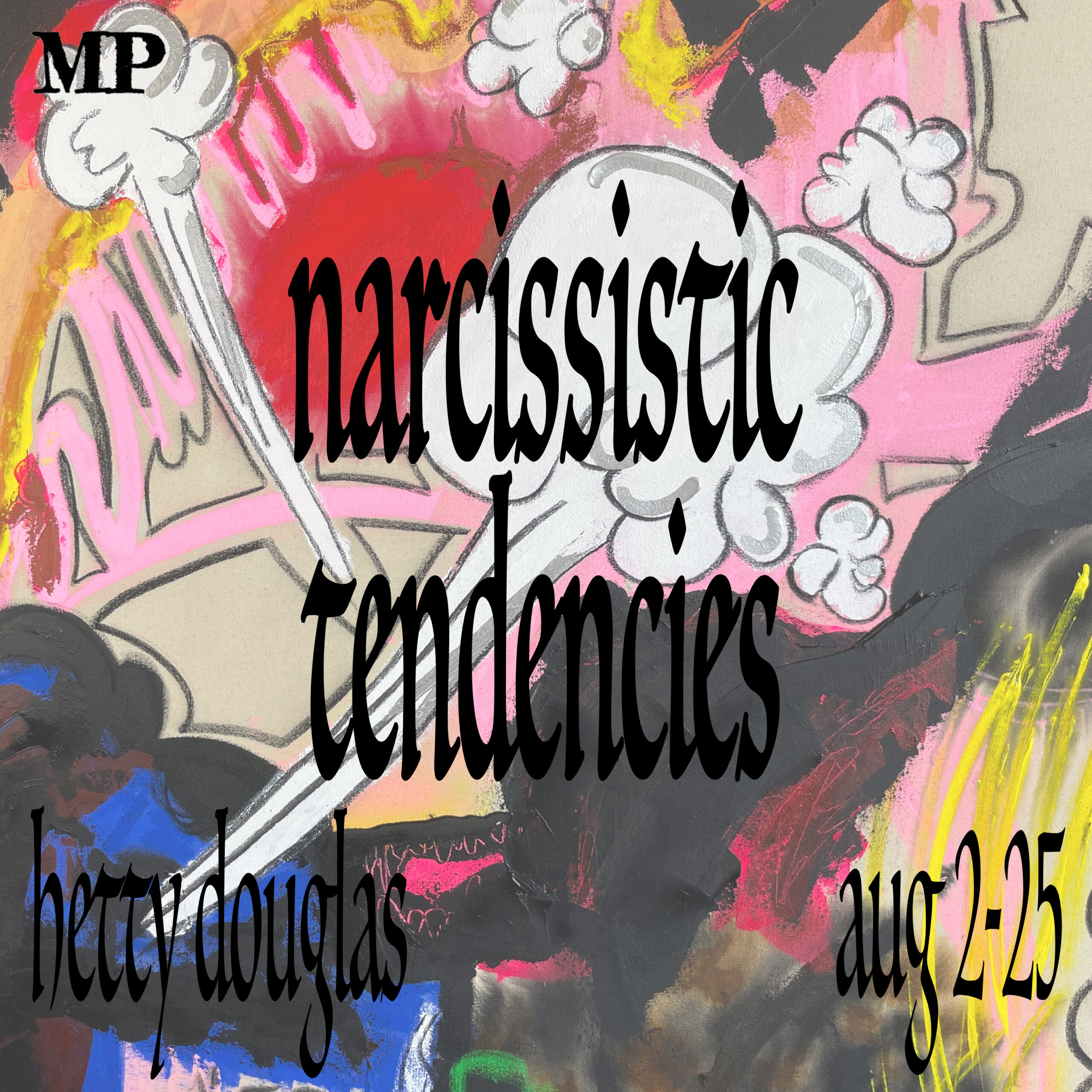
Hetty Douglas past exhibition a Mott Projects
Erik Sommer’s work does a similar thing, but on canvas.
When you bring this “graffitied” style into galleries, do you think the meaning changes? Does the art lose its rebelliousness when it enters a fancier space?
I don’t know if I’d call it “rebellious,” to begin with, but I think looser work looks great in a clean space. There’s something cheeky about it.
Personally, I love a ‘fancy’ space. The walls are fresh, and flush. Shadow gaps are so hot, and don’t even get me started on a solid, heavy, double door..
What do you think about the current state of the art market in the UK and worldwide? How is it affecting artists like you?
The market is always shifting, which presents both challenges and opportunities. I try to focus on making work that feels authentic to me, and trust there will be resonance.
I see my work as abstract painting, but not in the traditional decorative or landscape sense that seems to be popular right now, but there has been space for my work so far, and Im grateful for that.
But ultimately, it´s not really for me to decude where it fits, thats up to others and that[s none of my business.
Interview By Di Franco
Follow Hetty Douglas on Instagram
official Website - Hetty Douglas
About the Author:
All About DiFranco on Munchies Art Club
No spam, no sharing to third party. Only you and me.